Authentic Taqueria. Elevated Design.

Tacos 203
Deliverables
Branding
Website Design & Development
Background

After the success of their first collaboration with JUICE on The Taco Guy, owner Adrian Acosta approached the team again, this time to bring his newest concept, Tacos 203, to life.

The restaurant would open inside the South Norwalk Train Station, a high-traffic location with a history of short-lived businesses. To stand out and thrive, the brand needed to feel rooted in the local community while still carrying Adrian’s signature creativity and authenticity.

Key Concerns

  • Identity: The concept was brand new with no visual foundation. Everything from logo to palette to guidelines had to be developed from scratch.

  • Differentiation: Tacos 203 needed its own personality, separate from Adrian’s first restaurant brand (The Taco Guy), while retaining his recognizable culinary voice.

  • Timeline: Opening day was fast approaching, and the team had to deliver branding, collateral, signage, and a website simultaneously.

  • Cohesion: With so many deliverables moving in parallel, the brand risked fragmentation without a single creative partner overseeing the entire experience.

  • Longevity: Given the location’s track record, the visual identity needed to convey stability and trust to encourage repeat visits and local loyalty.

Mobile mockups of roobet crypto casino redesign

Solution:

JUICE delivered a comprehensive creative rollout, building Tacos 203 from concept to full launch in just a few months. The goal: create a brand that felt authentic, bold, and built to last.

Our approach centered on:

  • Brand differentiation: Positioning Tacos 203 as the late-night, community-driven cousin to The Taco Guy - fun, unfussy, and full of local flavor.

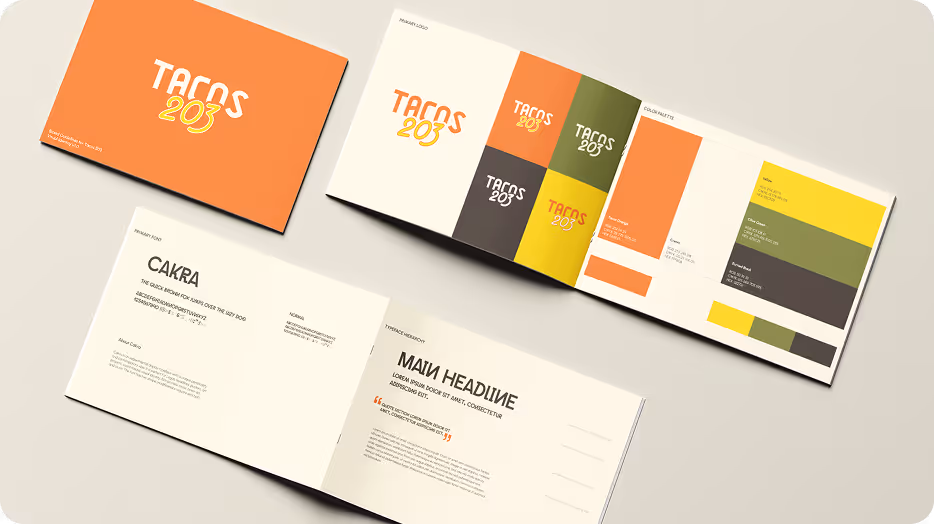
  • Fast-track branding: Over a three-week process, we developed a full visual identity system including logo, color palette, font hierarchy, and brand guidelines.

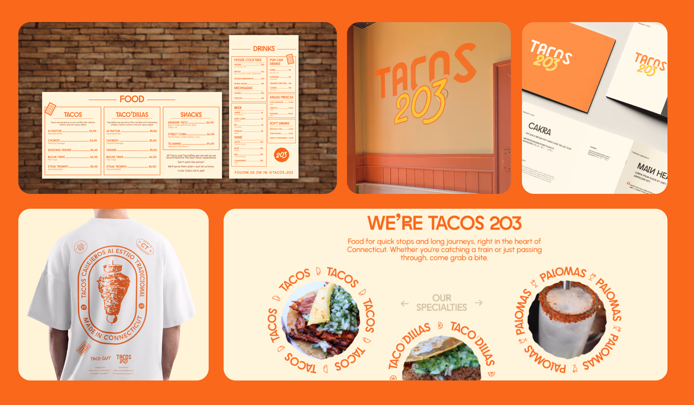
  • Seamless extension: Carrying the brand through signage, menus, merchandise, and a one-page website that embodied the same personality across every touchpoint.

  • Hands-on collaboration: With the client based locally, we met in person to review mockups, confirm materials, and ensure each design decision reflected the physical space and vibe.

Execution

Phase 1

(Strategy & Design)

  • Collaborated on a sitemap tailored to the restaurant’s needs and typical diner behaviors

  • Developed moodboards and selected fonts, illustration styles, and visual direction

  • Designed wireframes and high-fidelity homepage layouts focused on clarity and action

  • Finalized full site page designs using placeholder content prior to photography

Phase 2

(Development & Pre-Launch)

  • Developed the site in Webflow, emphasizing fast load times and responsive design

  • Created a “Coming Soon” landing page with newsletter signup to build anticipation

  • Scheduled and executed a photography shoot capturing both food and space just before launch

Phase 3

(Launch & Support)

  • Launched the full website on opening day, integrating edited photography and branded visuals

  • Added interactive animations to convey the brand personality

  • Provided ongoing updates and support: seasonal menu edits, special announcements, and UI improvements


Execution

Phase 1

(Visual Identity & Brand System)

  • Delivered three creative directions before finalizing the core identity.

  • Established logo suite, color palette, typography, and visual guidelines.

  • Produced exports and working files to support future collateral and marketing.

Phase 2

(Collateral & Merch Design)

  • Designed physical menus, exterior signage, and posters to support the opening.

  • Managed print production from design through vendor coordination and delivery.

  • Created branded merchandise, including T-shirts, that reinforced the street-style energy of the brand.

Phase 3

(Web Design & Developement)

  • Built a one-page website that captured the restaurant’s identity and enabled easy ordering via Toast and Uber Eats integrations.

  • Guided the client through copy structure and page flow to ensure clarity and conversion.

  • Designed custom graphics, stickers, and playful visual elements that carried over the brand’s tone digitally.

Results

Within the first two weeks post-launch:

18% more users than

The Taco Guy’s website in the same period

40% longer scroll depth

and +5 seconds average session time

Increased local awareness through consistent branding across web, print, and in-store. Tacos 203 quickly became a community staple, proof that strong brand foundations drive real-world traction.

Hi There!
Have a project?

What type of project are you interested in? (Select all that apply)
What is your budget?
Submit
Thank you! Your submission has been received!
Oops! Something went wrong while submitting the form.